The Psychology of Colors in Product Branding and Swag Design
Have you ever stopped to think about why certain brands use specific colors in their logos and promotional materials? It’s not just about aesthetics; it’s about tapping into the psychology of colors to evoke certain emotions and influence consumer behavior.
We are Pinnacle Promotions, considered the top promotional products suppliers, and in this guide, we’ll delve into the fascinating world of color psychology and how you can leverage it in your product branding and swag design to make a lasting impression.
Understanding Color Psychology
Colors have the power to evoke emotions, convey messages, and even influence purchasing decisions. In fact, studies show that 85% of customers identify color as the main reason for choosing one brand over another. That’s why choosing the right colors for your brand and promotional products is essential. It could literally tip the profit scales in your favor.
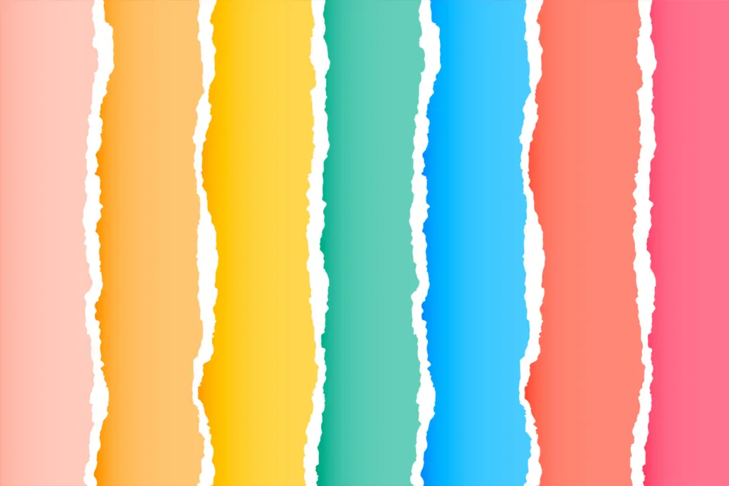
Let’s take a look at some common associations with different colors:
Red: Studies show that using red in advertising can increase heart rate and stimulate appetite, making it an effective choice for food and beverage brands. Red is often associated with passion, excitement, and urgency. Brands like Coca-Cola and Netflix use red in their logos to grab attention and create a sense of excitement.
Blue: As one of the most universally liked colors across cultures, blue is a safe choice for brands targeting diverse audiences. Blue evokes feelings of trust, reliability, and professionalism. Think of brands like IBM and Facebook, which use blue to convey a sense of security and dependability.
Yellow: Research suggests that yellow can increase mental activity and energy levels, making it a great choice for brands looking to capture attention and drive action. Yellow also represents optimism, happiness, and youthfulness. Brands like McDonald’s and Best Buy use yellow to create a cheerful and energetic vibe.
Green: Did you know green can promote a sense of relaxation and stress reduction? That’s why you see many health and wellness brands incorporate green. It is also associated with nature and growth. Companies like Starbucks and Whole Foods use green to convey sustainability and wellness.
Purple: Studies indicate that purple can stimulate creativity and imagination, making it a popular choice for brands targeting artistic and innovative audiences. It also symbolizes luxury, creativity, and royalty. Brands like Cadbury and Hallmark use purple to evoke a sense of sophistication and elegance.
Orange: Are you looking to create a sense of urgency or excitement with your brand? Then research suggests that orange is the color for you. Orange is effective for brands promoting limited-time offers and sales events. It also represents enthusiasm, creativity, and affordability. Home Depot and Nickelodeon use orange to create a vibrant and playful image.
Black: Maybe you’re aiming for a certain level of mystery and intrigue in your branding. If so, black can create these feelings, making it a popular choice for luxury brands looking to cultivate an aura of exclusivity. Brands like Chanel and Rolex often use black to convey elegance and prestige.
White: Research indicates that white can create a perception of spaciousness and cleanliness, making it a versatile choice for brands across various industries. Brands like Apple and Nike use white to create a sense of simplicity and sophistication.
Applying Color Psychology to Your Product Branding
Now that you understand the psychological associations with different colors, how can you apply this knowledge to your product branding and swag design?
Know Your Audience
Understanding your target audience is crucial when selecting colors for your branding and promotional materials. Consider factors like age, gender, cultural background, and psychographic traits.
Are they young and trendy, or more mature and traditional? Do they value innovation and creativity, or are they more conservative in their preferences? By gaining insight into your audience’s preferences and values, you can tailor your color choices to resonate with them on a deeper level.
Example: If your target audience consists of environmentally-conscious millennials, you might opt for shades of green to convey sustainability and eco-friendliness in your branding.
Stay Consistent
Consistency is key to building brand recognition and trust among your audience. Choose a color scheme that aligns with your brand identity, values, and messaging, and use it consistently across all your promotional materials.
This includes your logo, packaging, website, social media posts, and any customized products or promo giveaways. When you maintain a cohesive visual identity, you reinforce your brand’s image, making it easier for customers to recognize and remember you.
Example: Take inspiration from brands like Coca-Cola, whose iconic red and white color scheme is instantly recognizable worldwide.
Use Contrast Wisely
Contrast can be a powerful tool in design. It can help certain elements of your branding stand out and grab attention. Experiment with complementary colors to create visual interest and hierarchy in your promotional materials.
However, be mindful not to overdo it — too much contrast can be overwhelming and distracting. Strike a balance between boldness and harmony to ensure your design effectively communicates your message.
Example: The combination of blue and yellow in Best Buy’s branding creates a striking contrast that draws attention to its logo and reinforces its energetic and optimistic brand image.
Test and Iterate
Don’t be afraid to experiment! Explore different color combinations and designs to find what works best for your brand. Conduct A/B testing with small sample groups to gauge audience reactions and preferences.
Analyze the data and iterate on your designs based on the feedback you receive. By continuously refining your branding efforts, you can ensure that your colors resonate with your audience and drive the desired outcomes.
Example: Online retailers like Amazon frequently test different button colors and placements to optimize their websites for maximum conversions, showcasing the importance of testing and iteration in color selection.
Explore Our Range of Retail Brands!
Explore a variety of retail brands at Pinnacle Promotions to find the perfect promo giveaways for your promotional needs! From stylish retail apparel to trendy drinkware, we have the name-brand products you love. Partner with the best promotional product suppliers around!
Examples of Brands Mastering Color Psychology
Let’s take a closer look at some famous brands that have effectively used color psychology in their branding:
McDonald’s
The bright yellow and red colors in the McDonald’s logo evoke a sense of energy and excitement, perfect for a fast-food chain targeting families and young children. These colors grab attention, stimulating appetite. It also creates a vibrant atmosphere in their restaurants to encourage customers to indulge in their favorite meals.
Apple
Apple’s minimalist white logo exudes simplicity and sophistication, reflecting the brand’s commitment to innovative design and cutting-edge technology. The use of white creates a sense of purity and cleanliness while allowing the focus to remain on the customized products themselves. This simplicity has become synonymous with Apple’s sleek and modern aesthetic, reinforcing its position as a leader in the tech industry.
Starbucks
The iconic green logo of Starbucks evokes feelings of relaxation and connection with nature, aligning perfectly with the brand’s emphasis on sustainability and community. The use of the color green also creates a calming atmosphere in Starbucks stores, inviting customers to sit back, relax, and enjoy their coffee experience.
Partner with Pinnacle Promotions for Product Branding Success
By understanding the psychology of colors and how they influence perception and behavior, you can create compelling branded products and promotional materials that resonate with your audience and leave a lasting impression.
Whether designing a logo, packaging, or marketing collateral, harnessing the power of color psychology can help you connect with your customers on a deeper level and differentiate your brand in a crowded marketplace.
Elevate Your Brand with Pinnacle Promotions
At Pinnacle Promotions, we’re more than just one of the best promotional products suppliers. We’re your partner in product branding success. Our team of dedicated experts can help you navigate the world of color psychology and create customized products that elevate your brand’s visibility and impact.
Whether you’re looking to design eye-catching swag for your next event or revamp your branding materials with strategic color choices, we’re here to guide you every step of the way.
Ready to take your brand to the next level? Visit our About Us page to learn more about how Pinnacle Promotions can help your brand thrive. Let’s create something unforgettable together!